Core concept
Styles only
Stylo follows a philosophy called Styles only, with which it provides a wide range of style definitions required for any React Native app. Stylo believes that separating the styles from React Native components can provide high flexibility & infinite scalability. Instead of providing components like Button, Badge, Avatar, Form etc, Stylo provides all the styles needed for these components & with the same naming convention Button, Badge, Avatar, Form etc. By simply applying these styles to React Native components, like TouchableOpacity, View, Text etc, one can create beautiful Buttons, Badges, Forms & so on. The library provides extensive style definitions enough to style/create all kinds of components, right from simple Text to complicated Pickers & Forms.
In practice, there are scenarios where a Badge can technically either be a View or be a TouchableOpacity. Similarly, a list item can be a non-touchable View or TouchableOpacity, so on & so forth. With Stylo, you can easily define & configure the styles such a way that it allows applying same styles or selected styles to View, TouchableOpacity, Text or Image etc.
Stylo provides a default theme with all the pre-defined style types & styles with which you can create all kind of components like Avatar, Badge, Form, List etc. You can easily install & setup the theme & then can immediately start using it or even modify it as per needs.
Theme & StyleName
Theme is nothing but a collection of styles defined using the React Native's StyleSheet.create() API. The theme is used by the library and its hooks/components to apply styles to the React Native components. There is no restriction on the format of the style names, these can be defined as per the needs.
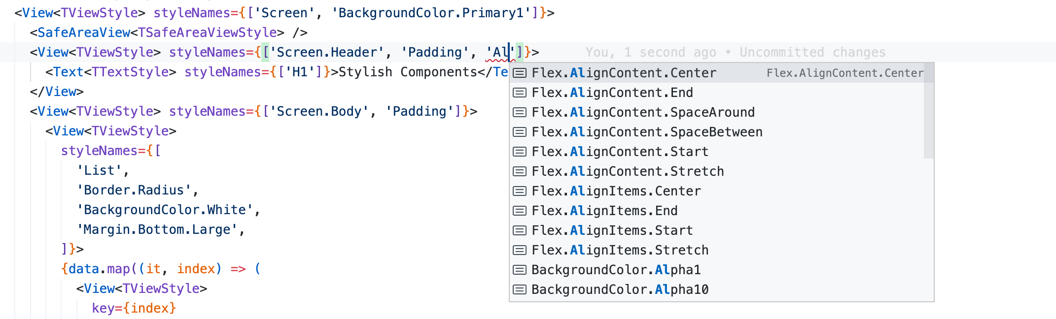
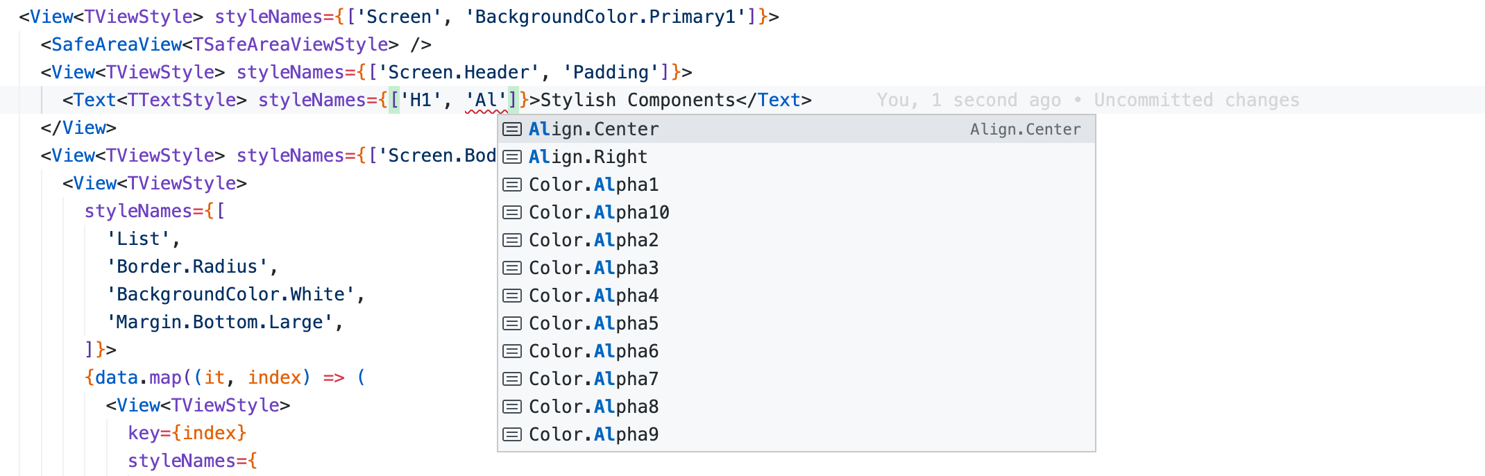
StyleName is the name of a standard style definition provided to the StyleSheet.create API. In the code snippet below 'Align.Center', H1, Small are the style names.
const TextStyles = StyleSheet.create({
  Default: { color: '#000000', fontSize: 16, fontWeight: '400', lineHeight: 24 },
  'Align.Center': { textAlign: 'center' },
  'Align.Right': { textAlign: 'right' },
  H1: { fontSize: 32, fontWeight: '400', lineHeight: 40, marginBottom: 16 },
  H2: { fontSize: 28, fontWeight: '400', lineHeight: 36, marginBottom: 16 },
  H3: { fontSize: 24, fontWeight: '400', lineHeight: 32, marginBottom: 8 },
  Small: { fontSize: 12, lineHeight: 18 },
  'Size.Tiny': { fontSize: 8, lineHeight: 14 },
  ...
});

const TextInputStyles = StyleSheet.create({
  Default: { borderRadius: 8, color: '#000000', fontSize: 16, paddingTop: 12, paddingBottom: 12, paddingLeft: 8, paddingRight: 8 },
  Small: { fontSize: 12, paddingTop: 8, paddingBottom: 8 },
  ...
});
const ViewStyles = StyleSheet.create({ ... });

export const Theme = {
  TextStyles,
  TextInputStyles,
  ViewStyles,
};
Stylish React Native components
The library just adds a new property called styleNames to the React Native components. The property styleNames in React Native mobile app is just like class in web app. The style names are defined in the theme, e.g. List, List.Item, Color.Primary, Border, Size.Large etc. Just supply these names of the styles to the prop styleNames and it will pick the style definitions from theme and apply to the React Native component. The library does not add any other behavior or action to the React Native components. This keeps the React Native components as pure as they are defined by React Native. After all, these are just React Native components.
import React from 'react';
import { Image, SafeAreaView, Text, View } from '../../../stylo';
import { TImageStyle, TSafeAreaViewStyle, TTextStyle, TViewStyle } from '../../stylo/themes/types';
const data = [
{ name: 'Narayan Naresh Nathani', profileUrl: require('../../images/face-icon-1.png'), role: 'UI Developer' },
{ name: 'Sumitra Suresh Sundaram', profileUrl: require('../../images/face-icon-2.png'), role: 'UX Designer' },
{ name: 'Indumati Indraneel Iyengar', profileUrl: require('../../images/face-icon-3.png'), role: 'Software Developer' },
];
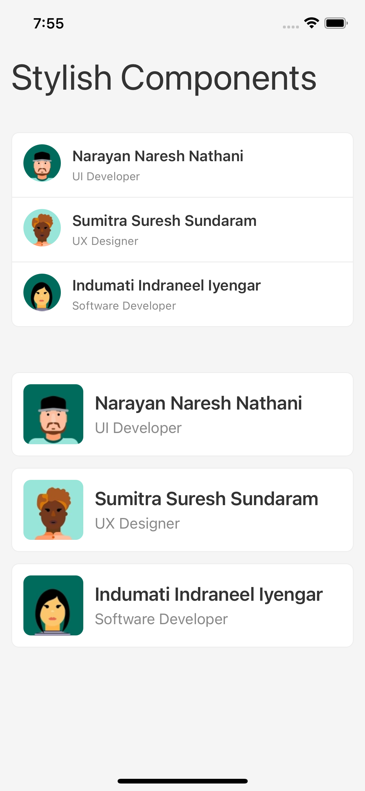
const CoreConceptStylishComponentsShowCase = () => (
<View<TViewStyle> styleNames={['Screen']}>
<SafeAreaView<TSafeAreaViewStyle> />
<View<TViewStyle> styleNames={['Screen.Header', 'Padding']}>
<Text<TTextStyle> styleNames={['H1']}>Stylish Components</Text>
</View>
<View<TViewStyle> styleNames={['Screen.Body', 'Padding']}>
<View<TViewStyle>
styleNames={['List', 'Border', 'Border.Radius', 'BackgroundColor.Alpha10', 'Margin.Bottom.Large']}>
{data.map((it, index) => (
<View<TViewStyle>
key={index}
styleNames={
index > 0 ? ['List.Item', 'Border.Top'] : ['List.Item']
}>
<View<TViewStyle> styleNames={['List.Item.Left']}>
<Image<TImageStyle>
styleNames={['Avatar']}
source={it.profileUrl}
/>
</View>
<View<TViewStyle> styleNames={['List.Item.Body']}>
<Text<TTextStyle> styleNames={['Bold.Semi']}>{it.name}</Text>
<Text<TTextStyle> styleNames={['Color.Secondary', 'Small']}>
{it.role}
</Text>
</View>
</View>
))}
</View>
<View<TViewStyle> styleNames={['List', 'Margin.Top.Large']}>
{data.map((it, index) => (
<View<TViewStyle>
key={index}
styleNames={['List.Item', 'Border' ,'Border.Radius', 'BackgroundColor.Alpha10', 'Margin.Bottom']}>
<View<TViewStyle> styleNames={['List.Item.Left']}>
<Image<TImageStyle>
styleNames={['Avatar', 'Avatar.Large', 'Avatar.Square']}
source={it.profileUrl}
/>
</View>
<View<TViewStyle>
styleNames={['List.Item.Body', 'Flex.JustifyContent.Center']}>
<Text<TTextStyle> styleNames={['Large', 'Bold.Semi']}>
{it.name}
</Text>
<Text<TTextStyle> styleNames={['Color.Secondary']}>
{it.role}
</Text>
</View>
</View>
))}
</View>
</View>
</View>
);
export default CoreConceptStylishComponentsShowCase;
Strongly typed & intellisense friendly styles
The styles are strongly typed. So the accidental usage of using wrong style name is completely avoided out of the box. These style types are defined inside the consumer app and not inside the Stylo library. The app can use any naming convention to define these types.
export type TFontColorStyle = 'Color.Primary' | 'Color.Secondary' | 'Color.Info' | 'Color.Success' | 'Color.Warning' | 'Color.Danger';
export type TBackgroundColorStyle = 'BackgroundColor.Primary' | 'BackgroundColor.Secondary' | 'BackgroundColor.Info' | 'BackgroundColor.Success' | 'BackgroundColor.Warning' | 'BackgroundColor.Danger';
export type TPaddingStyle = 'Padding' | 'Padding.Top' | 'Padding.Right' | 'Padding.Bottom' | 'Padding.left';
export type TMarginStyle = 'Margin' | 'Margin.Top' | 'Margin.Right' | 'Margin.Bottom' | 'Margin.left';
export type TBorderStyle = 'Border' | 'Border.Radius' | 'Border.Radius.Small' | 'Border.Radius.Large';

export type TTextStyle = TFontColorStyle | TBackgroundColorStyle | 'Bold' | 'H1' | 'H2' | 'H3' | 'H4' | 'Small' | 'Size.Tiny';
export type TTextInputStyle = TFontColorStyle | TBackgroundColorStyle | TPaddingStyle | TMarginStyle | TBorderStyle | 'Align.Center' | 'Align.Right' | 'Small' | 'Size.Tiny';
export type TViewStyle = TBackgroundColorStyle | TPaddingStyle | TMarginStyle | TBorderStyle;
On top of that, the style names are strongly typed per React Native component, like View, Text, TouchableOpacity etc. This adds an extra level of strong typing with which only the styles names which are intended for the component can be used.
E.g. Alignment styles for View & Text are different. As you start typing the alignment styles, the editor intellisense helps you choose correct styles for View & Text.
The Stylo library provides default style types, which can be copied into the app and can be easily customized, if needed.
Infinitely scalable
As both the style types & the styles are defined by the consumer app & not by the library, the app can add/remove/modify as many styles as it wants and they way it wants. App can keep adding it's own types & styles as per the needs like Card, Card.Header, Card.Body, Card.Footer, Picker, Picker.Header & so on. Create these style types and styles and just add them to the Theme. That's it.
//types.ts;
export type TCardStyle = 'Card' | 'Card.Header' | 'Card.Body' | 'Card.Footer';
export type TViewStyle = TBackgroundColorStyle | TPaddingStyle | TMarginStyle | TBorderStyle | TCard;
export type TTouchableStyle = TBackgroundColorStyle | TPaddingStyle | TMarginStyle | TBorderStyle | TCard;

//card-styles.ts
export const CardStyles = StyleSheet.create({
  Card: {...},
  'Card.Header': {...},
  'Card.Body': {...},
  'Card.Footer': {...},
});

//theme.ts
export const Theme = {
  ViewStyles: {
    ...[ExistingViewStyles],
    ...CardStyles,
  },
  TouchableStyles: {
    ...[ExistingTouchableStyles],
    ...CardStyles,
  },
};
Stylo library provides predefined style types and styles. App can copy these and then extend them infinitely. It can add new types/styles, change names of existing types/styles or modify the style definitions.
Detached styles, owned by app, not by library
The style definitions or themes are completely detached from the Stylo library. The style types & styles/themes reside inside the app not inside the library. The library only provides a set of hooks and extended React Native components. The consumer application has the entire ownership & liberty of defining the style types, styles & their names (any naming pattern/convention).
MobileApp
  |- components
  |- screens
  |- stylo
    |- themes
        |- types
          |- text-style-types.ts
          |- text-input-style-types.ts
          |- touchable-style-types.ts
          |- view-style-types.ts
          |- ...
        |- light
          |- text-styles.ts
          |- text-input-styles.ts
          |- touchable-styles.ts
          |- view-styles.ts
          |- ...
        |- dark
          |- text-styles.ts
          |- text-input-styles.ts
          |- touchable-styles.ts
          |- view-styles.ts
          |- ...
The library provides a set of predefined style types & themes. These can be used as is or can be considered as a guidelines or can be simply copied into the app & customized/modified easily as per the needs.