Theme
Theme at core is nothing but a collection of styles defined using the React Native's StyleSheet.create() API. The themes are defined inside the app and are completely owned by the app, not by the Stylo library. Stylo theme is based on two key concepts: StyleName & StyleNamespace.
StyleName
StyleName is the name of a standard style definition provided to the StyleSheet.create API. A unified collection of StyleNames & their style definitions results into a Theme. Any suitable naming convention can be used for the StyleNames. A common good practice is to group the style definitions per React Native component.
In the code snippet below 'Align.Center', H1, Small are the style names.
Type definition
type TTextStyle = 'Align.Center' | 'Align.Right' | 'H1' | 'H2' | 'H3' | 'Small' | 'Size.Tiny';
type TInputTextStyle = 'Align.Center' | 'Align.Right' | 'Small' | 'Size.Tiny';
The document explains the significance & usage of the type definitions in the theme in the later section. The StyleName type definitions are passed to & used by Styler hooks & Stylish components. They are not directly used in the StyleSheet.create() API.
Styles defined using the StyleNames
const TextStyles = StyleSheet.create({
  Default: { color: '#000000', fontSize: 16, fontWeight: '400', lineHeight: 24 },
  'Align.Center': { textAlign: 'center' },
  'Align.Right': { textAlign: 'right' },
  H1: { fontSize: 32, fontWeight: '400', lineHeight: 40, marginBottom: 16 },
  H2: { fontSize: 28, fontWeight: '400', lineHeight: 36, marginBottom: 16 },
  H3: { fontSize: 24, fontWeight: '400', lineHeight: 32, marginBottom: 8 },
  Small: { fontSize: 12, lineHeight: 18 },
  'Size.Tiny': { fontSize: 8, lineHeight: 14 },
});

const TextInputStyles = StyleSheet.create({
  Default: { borderRadius: 8, color: '#000000', fontSize: 16, paddingTop: 12, paddingBottom: 12, paddingLeft: 8, paddingRight: 8 },
  'Align.Center': { textAlign: 'center' },
  'Align.Right': { textAlign: 'right' },
  Small: { fontSize: 12, paddingTop: 8, paddingBottom: 8 },
  Large: { fontSize: 24, paddingTop: 16, paddingBottom: 16, paddingLeft: 10, paddingRight: 10 },
});
Reserved StyleName Default
Default is a reserved StyleName. It's used for the core React Native components like Text, View, TextInput, Image etc. Stylo applies the styles defined under Default StyleName as a default style to the components.
In the code snipper below, the style defined as Default will get applied by default to Text component.
const TextStyles = StyleSheet.create({
  Default: { color: '#000000', fontSize: 16, fontWeight: '400', lineHeight: 24 },
  H1: { fontSize: 32, fontWeight: '400', lineHeight: 40, marginBottom: 16 },
  H2: { fontSize: 28, fontWeight: '400', lineHeight: 36, marginBottom: 16 },
  ...
});
import { Text } from 'react-native-stylo';

const ComponentA = () => (
  <Text>React Native Stylo</Text>
);
StyleNamespace
StyleNamespaces are used to organize the style definitions by logically grouping them together. Means, all style definitions for React Native's Text component can be grouped together under a namespace called TextStyles, likewise ViewStyles, TouchableStyles, TextInputStyles etc. This prevents collisions of the StyleName & eventually the collisions of styles. For example, a StyleName Small can exist for both Text & View and can have different style definitions for each. So placing these different stye definitions with same StyleName Small under separate namespaces TextStyles & ViewStyles will avoid the collision or accidental overriding of style definitions.
Stylo considers each React Native component as one StyleNamespace. To keep it simple & easily understandable, Stylo uses a pattern [ReactNativeComponentName]Styles to name the StyleNamespace. The library uses following StyleNamespaces defined for each React Native component.
type TStyleNamespace =
  | 'IconStyles'
  | 'ImageBackgroundStyles'
  | 'ImageStyles'
  | 'SafeAreaViewStyles'
  | 'ScrollViewStyles'
  | 'ScrollViewContentContainerStyles'
  | 'TextInputStyles'
  | 'TextStyles'
  | 'TouchableStyles'
  | 'ViewStyles';
Note: New StyleNamespaces for remaining components will be added soon.
The styles are defined and assigned to these namespaces. And then are used to define a theme.
const TextStyles = StyleSheet.create({ ... });
const IconStyles = StyleSheet.create({ ... });
const ImageBackgroundStyles = StyleSheet.create({ ... });
// & so on ...

const Theme = {
  TextStyles,
  IconStyles,
  ImageBackgroundStyles,
  ...
};
The approach of one namespace per React Native component makes it highly scalable & easily manageable. New namespaces for remaining or new ReactNative components can be added without impacting existing onces. Stylo uses these namespaces by default.
Variables
Variables are the core configuration values which are used to define the styles. Like, colors, paddings, margins etc. These variable definitions can look like below.
Type definition
export type TVariable =
  | 'Color.Primary'
  | 'Color.Secondary'
  | 'Padding'
  | 'Padding.Small'
  | 'Padding.Large'
  | 'Border.Radius';
The document explains the significance & usage of the type definitions in the theme in the later section. The variables type definitions are passed to & used by useVariables() hook.
Variable values
const variables = {
  'Color.Primary': '#000000',
  'Color.Secondary': '#888888',
  'Border.Radius': 6,
  Padding: 12,
  'Padding.Small': 8,
  'Padding.Large': 24,
};
Type definitions
Thanks to TypeScript, the StyleNames & Variables are strongly typed. The type definitions are passed to & used by useVariables() hook, Styler hooks & Stylish components. This completely avoids accidental usage of wrong StyleNames & Variables, out of the box. On top of that, the StyleNames are strongly typed against each React Native component, like View, Text, TouchableOpacity etc. This adds an extra level of strong typing which forces to use only those values which are intended for a particular component.
Variables type definition
type TFontColorStyle = 'Color.Primary' | 'Color.Secondary' | 'Color.Info' | 'Color.Warning' | 'Color.Danger' | 'Color.Border' | 'Color.Grey1' | 'Color.Grey2' | 'Color.Grey1' | ... ;
type TBackgroundColorStyle = 'BackgroundColor.Primary' | 'BackgroundColor.Secondary' | 'BackgroundColor.Info' | 'BackgroundColor.Warning' | 'BackgroundColor.Danger' | 'BackgroundColor.Grey1' | 'BackgroundColor.Grey2' | 'BackgroundColor.Grey1' | ... ;
type TPaddingStyle = 'Padding' | 'Padding.Small' | 'Padding.Large';
type TMarginStyle = 'Margin' | 'Margin.Small' | 'Margin.Large';
type TBorderStyle = 'Border.Radius' | 'Border.Radius.Small' | 'Border.Radius.Large';
...

export type TVariable = TFontColorStyle | TBackgroundColorStyle | TPaddingStyle | TMarginStyle | TBorderStyle | ...;
StyleName type definition
type TBorderStyle = 'Border' | 'Border.Top' | 'Border.Right' | 'Border.Bottom' | 'Border.Left' | 'Border.Radius' | 'Border.Radius.Small' | 'Border.Radius.Large' | 'Border.Color.Primary' | 'Border.Color.Secondary' | 'Border.Color.Info' | 'Border.Color.Warning' | 'Border.Color.Danger' | 'Border.Color.Grey1' | 'Border.Color.Grey2' | ...;
export type TTextStyle = TFontColorStyle | 'Align.Center' | 'Align.Right' | 'Bold' | 'H1' | 'H2' | 'H3' | 'H4' | 'Small' | 'Large' | 'Paragraph' | 'Margin' | 'Margin.Top' | 'Margin.Right' | 'Margin.Bottom' | 'Margin.Left' | 'Margin.Mini' | 'Margin.Small' | 'Margin.Large' | 'Margin.Top.Small' | 'Margin.Right.Small' | 'Margin.Bottom.Small' | 'Margin.Left.Small' | 'Margin.Top.Mini' | 'Margin.Right.Mini' | 'Margin.Bottom.Mini' | 'Margin.Left.Mini' | 'Margin.Top.Large' | 'Margin.Right.Large' | 'Margin.Bottom.Large' | 'Margin.Left.Large';
export type TViewStyle = TBackgroundColorStyle | TPaddingStyle | TMarginStyle | TBorderStyle | ...;
export type TTouchableStyle = TBackgroundColorStyle | TPaddingStyle | TMarginStyle | TBorderStyle | 'Button' | 'Button.Small' | 'Button.Large' | 'Button.Round' | 'Button.Circle' | ...;
...
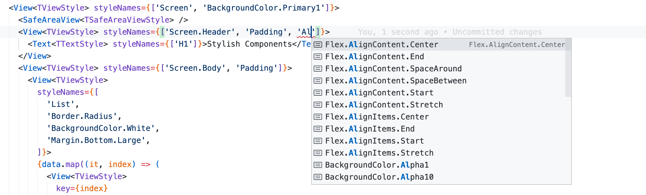
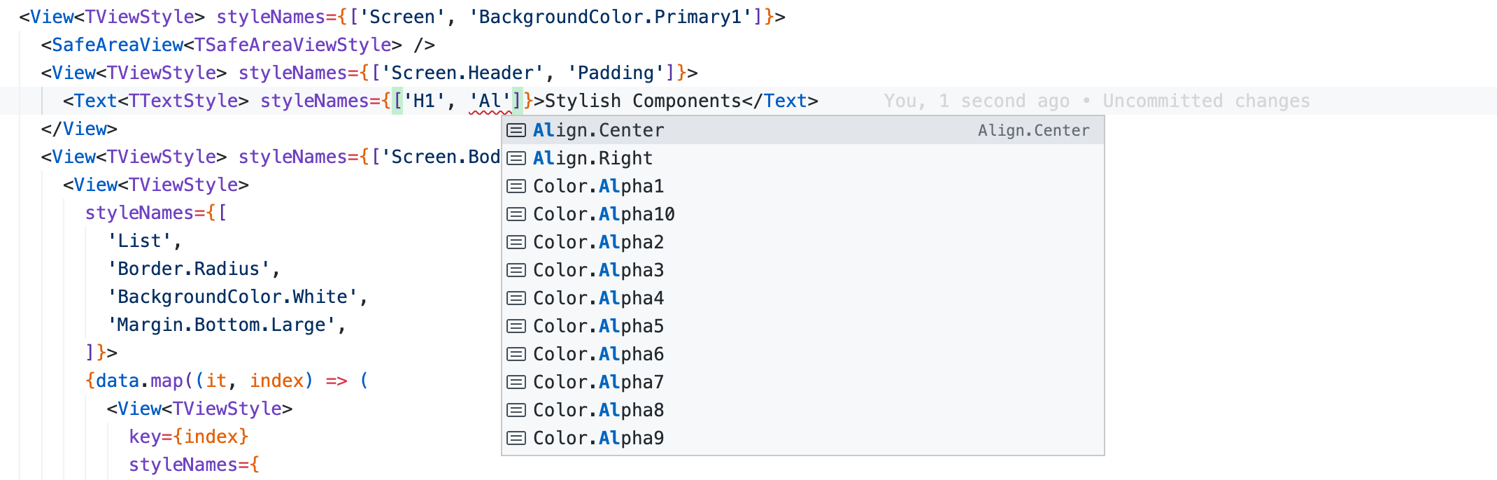
Intellisense friendly styles
The Variables & StyleNames are intellisense friendly, it helps you choose correct styles & values.
E.g. Alignment styles for View & Text are different. As you start typing the alignment styles, the editor intellisense helps you choose correct styles for View & Text.