Setup & usage
Installation
Peer dependency:
Stylo uses Vector Icons, so it has a peer dependency of react-native-vector-icons@^9.1.0.
npm install --save react-native-vector-icons@^9.1.0 react-native-stylo
OR
yarn add react-native-vector-icons@^9.1.0 react-native-stylo
Configure theme, styled hooks & components
Stylo provides a default theme & its tightly coupled styling elements, Stylish components & Styler hooks, which are located at /node_modules/react-native-stylo/lib/stylo. Just copy the these to your project. You can freely modify the theme as per your needs.
E.g. cp -R [root]/node_modules/react-native-stylo/lib/stylo [root]/app/stylo
[root]
  |- app
    |- components
    |- screens
    |- stylo
      |- stylers
      |- stylish
      |- themes
        |- types
        |- default
You can create your own themes right from scratch. Please refer the Theme documentation for more details.
The need for coping the stylers & stylish directories is explained it the document Tight coupling. To better understand the tight coupling, we recommend you to first go through the Core concept, Theme, Stylish & Stylers documents.
ThemeProvider setup
Wrap the application inside the ThemeProvider and supply the theme to it. The theme is collection of variables & and style definitions. ThemeProvider expects both variables & styles to be supplied to it.
import { ThemeProvider } from 'react-native-stylo';
import { variables, styles } from './stylo/themes/default';

const App = () => (
  <ThemeProvider variables={variables.light} styles={styles.light}> /* OR use variables.dark & styles.dark */
    // Application components
  </ThemeProvider>
);
Please refer the <ThemeProvider /> documentation for more details.
Using stylish components
Stylish components are nothing but enhanced React Native components with added property called styleNames. Property styleNames accepts the eligible styles for the component which are defined in the theme.
import React from 'react';
import Stylish from '../../stylo/stylish';

const data = [
  { name: 'Narayan Naresh Nathani', profileUrl: require('../../images/face-icon-1.png'), role: 'UI Developer' },
  { name: 'Sumitra Suresh Sundaram', profileUrl: require('../../images/face-icon-2.png'), role: 'UX Designer' },
  { name: 'Indumati Indraneel Iyengar', profileUrl: require('../../images/face-icon-3.png'), role: 'Software Developer' },
];

const UsageStylishComponentsShowCase = () => (
  <Stylish.View styleNames={['Screen']}>
    <Stylish.SafeAreaView />
    <Stylish.View styleNames={['Screen.Header', 'Padding']}>
      <Stylish.Text styleNames={['H1']}>Usage</Stylish.Text>
    </Stylish.View>
    <Stylish.View styleNames={['Screen.Body', 'Padding']}>
      <Stylish.Text styleNames={['H3', 'Margin.Bottom.Large']}>
        Stylish Components
      </Stylish.Text>
      <Stylish.View
        styleNames={['List', 'Border', 'Border.Radius', 'BackgroundColor.Alpha10', 'Margin.Bottom.Large']}>
        {data.map((it, index) => (
          <Stylish.View
            key={index}
            styleNames={
              index > 0 ? ['List.Item', 'Border.Top'] : ['List.Item']
            }>
            <Stylish.View styleNames={['List.Item.Left']}>
              <Stylish.Image styleNames={['Avatar']} source={it.profileUrl} />
            </Stylish.View>
            <Stylish.View styleNames={['List.Item.Body']}>
              <Stylish.Text styleNames={['Bold.Semi']}>{it.name}</Stylish.Text>
              <Stylish.Text styleNames={['Color.Secondary', 'Small']}>
                {it.role}
              </Stylish.Text>
            </Stylish.View>
          </Stylish.View>
        ))}
      </Stylish.View>
    </Stylish.View>
  </Stylish.View>
);

export default UsageStylishComponentsShowCase;
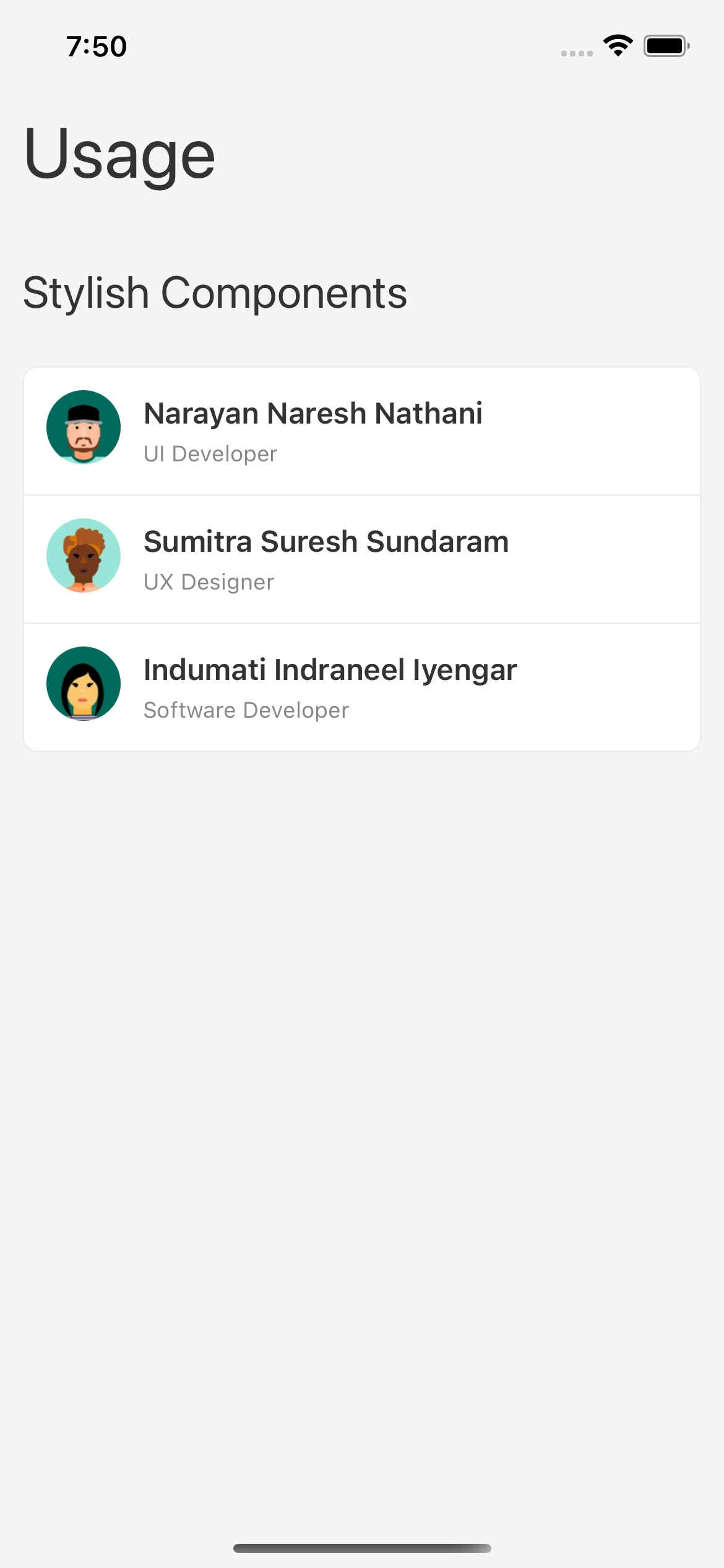
Please refer the Stylish documentation for more details.
Using stylers
Stylers are styling hooks which are used to define the styles for the components. Use these stylers in case you like to use the core React Native components instead of Stylo's stylish components. The styler hooks accept an argument styleNames. The argument styleNames accepts the eligible styles for the component which are defined in the theme.
import React, { useRef } from 'react';
import { Image, SafeAreaView, Text, View } from 'react-native';
import Stylers from '../../stylo/stylers';

const data = [
  { name: 'Narayan Naresh Nathani', profileUrl: require('../../images/face-icon-1.png'), role: 'UI Developer' },
  { name: 'Sumitra Suresh Sundaram', profileUrl: require('../../images/face-icon-2.png'), role: 'UX Designer' },
  { name: 'Indumati Indraneel Iyengar', profileUrl: require('../../images/face-icon-3.png'), role: 'Software Developer' },
];

const UsageStylersShowCase = () => {
  const styles = useRef({
    screen: Stylers.useViewStyles(['Screen']),
    screenHeader: Stylers.useViewStyles(['Screen.Header', 'Padding']),
    screenTitle: Stylers.useTextStyles(['H1']),
    screenBody: Stylers.useViewStyles(['Screen.Body', 'Padding']),
    listTitle: Stylers.useTextStyles(['H3', 'Margin.Bottom.Large']),
    list: Stylers.useViewStyles(['List', 'Border', 'Border.Radius', 'BackgroundColor.Alpha10', 'Margin.Bottom.Large']),
    listItem: Stylers.useViewStyles(['List.Item', 'Border.Top']),
    listLastItem: Stylers.useViewStyles(['List.Item']),
    listItemLeft: Stylers.useViewStyles(['List.Item.Left']),
    listItemBody: Stylers.useViewStyles(['List.Item.Body']),
    name: Stylers.useTextStyles(['Bold.Semi']),
    role: Stylers.useTextStyles(['Color.Secondary', 'Small']),
    avatar: Stylers.useImageStyles(['Avatar']),
  }).current;

  return (
    <View style={styles.screen}>
      <SafeAreaView />
      <View style={styles.screenHeader}>
        <Text style={styles.screenTitle}>Usage</Text>
      </View>
      <View style={styles.screenBody}>
        <Text style={styles.listTitle}>Stylers</Text>
        <View style={styles.list}>
          {data.map((it, index) => (
            <View
              key={index}
              style={index > 0 ? styles.listItem : styles.listLastItem}>
              <View style={styles.listItemLeft}>
                <Image style={styles.avatar} source={it.profileUrl} />
              </View>
              <View style={styles.listItemBody}>
                <Text style={styles.name}>{it.name}</Text>
                <Text style={styles.role}>{it.role}</Text>
              </View>
            </View>
          ))}
        </View>
      </View>
    </View>
  );
};

export default UsageStylersShowCase;
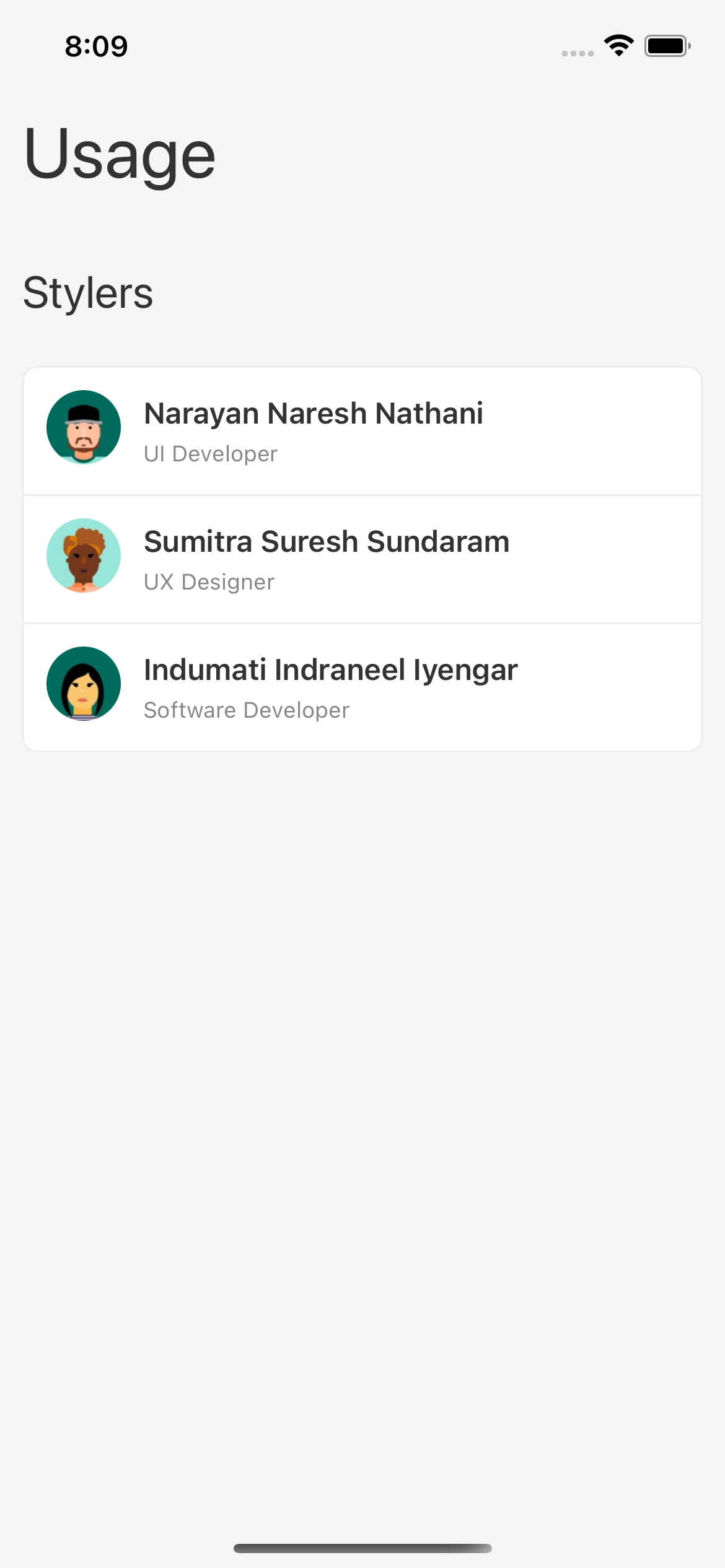
Please refer the Stylers documentation for more details.
Using variables
Variables are the core configuration values which are used to define the themes. Like, colors, paddings, margins etc. useVariables() hook is used to access the theme configuration values to create your own custom page specific styles.
import React, { useRef } from 'react';
import { SafeAreaView, StyleSheet, Text, View } from 'react-native';
import Stylers from '../../stylo/stylers';

const UsageUseVariablesShowCase = () => {
  const [padding, paddingLarge, margin, marginLarge, borderColor, borderRadius, fontColor, fontSize, screenColor, colorAlpha10]
    = Stylers.useVariables(['Padding', 'Padding.Large', 'Margin', 'Margin.Large', 'Border.Color', 'Border.Radius', 'Font.Color', 'Font.Size', 'Screen.BackgroundColor', 'Color.Alpha10']);

  const styles = useRef(
    StyleSheet.create({
      screen: { flex: 1, backgroundColor: screenColor.toString(), padding: Number(paddingLarge) },
      screenHeader: { paddingVertical: Number(paddingLarge) },
      screenBody: { padding: Number(padding) },
      text: { color: fontColor.toString(), fontSize: Number(fontSize) },
      h1: { fontWeight: '500', fontSize: 48, marginBottom: Number(marginLarge) },
      h2: { fontWeight: '600', fontSize: 32, marginBottom: Number(marginLarge) },
      paragraph: { marginBottom: Number(margin) },
      card: { padding: Number(padding), borderWidth: 1, borderColor: borderColor.toString(), borderRadius: Number(borderRadius), backgroundColor: colorAlpha10.toString() },
    }),
  ).current;

  return (
    <View style={styles.screen}>
      <SafeAreaView />
      <View style={styles.screenHeader}>
        <Text style={[styles.text, styles.h1]}>Usage</Text>
      </View>
      <Text style={[styles.text, styles.h2]}>useVariables()</Text>
      <View style={styles.card}>
        <Text style={[styles.text, styles.paragraph]}>
          Variables are the core configuration values which are used to define
          the themes. Like, colors, paddings, margins etc.
        </Text>
        <Text style={styles.text}>
          The useVariables() hook is used to access the Theme Variables. A
          practical use of the useVariables() hook can be accessing & using the
          theme variable values to define styles inside the StyleSheet.create()
          API.
        </Text>
      </View>
    </View>
  );
};

export default UsageUseVariablesShowCase;
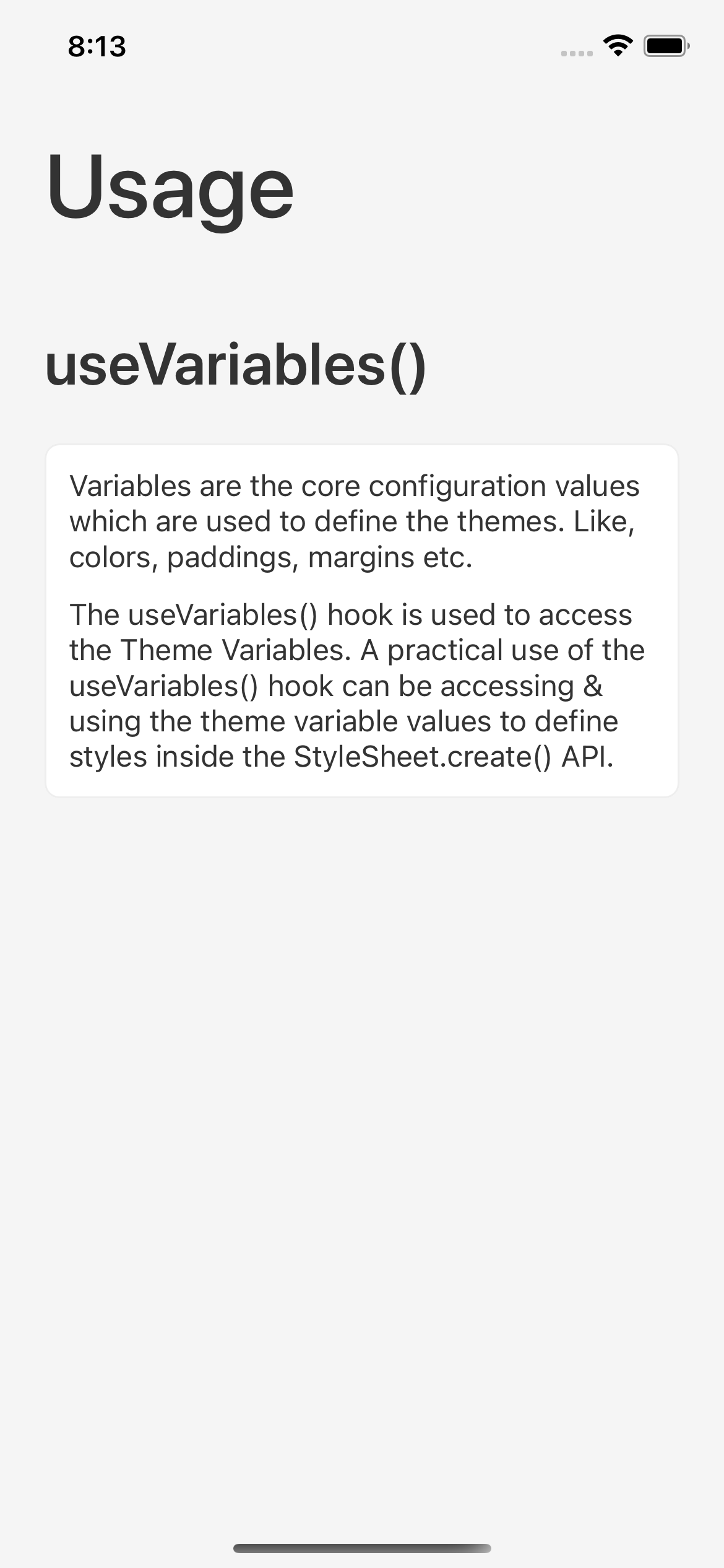
Please refer the useVariables() documentation for more details.