Screen
Type definition
type TScreenStyle =
  | 'Screen'
  | 'Screen.Header'
  | 'Screen.Header.Left'
  | 'Screen.Header.Body'
  | 'Screen.Header.Right'
  | 'Screen.Body'
  | 'Screen.Footer';
StyleNames hierarchy
'Screen'
  |- 'Screen.Header'
    |- 'Screen.Header.Left'
    |- 'Screen.Header.Body'
    |- 'Screen.Header.Right'
  |- 'Screen.Body'
  |- 'Screen.Footer';
Usage
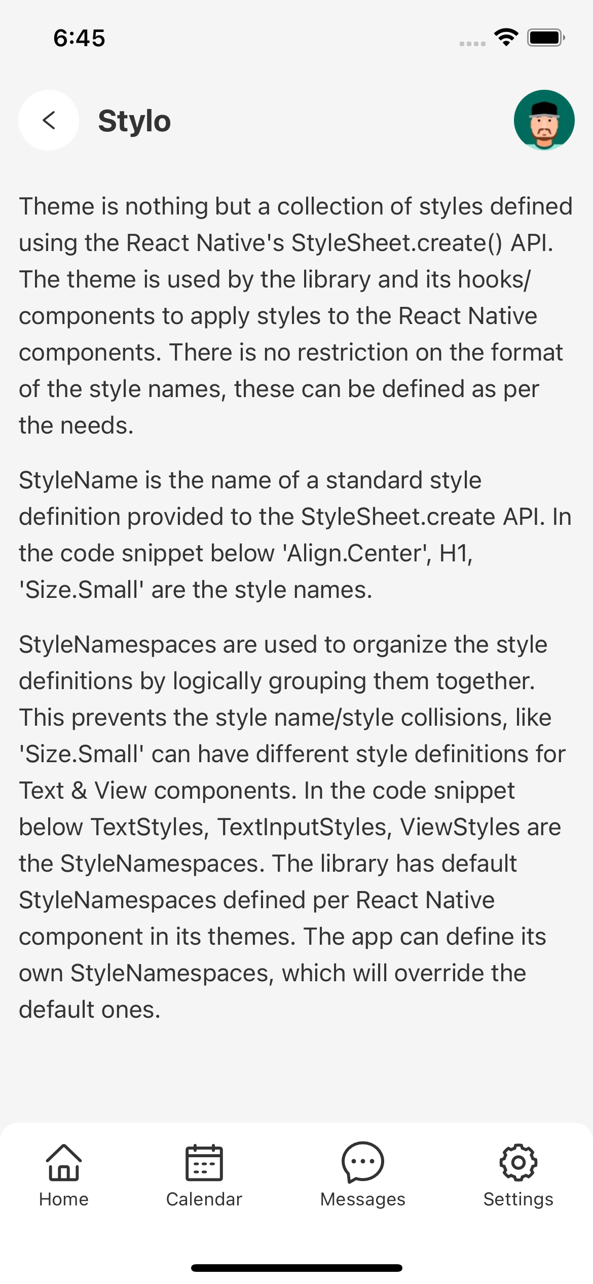
<Stylish.View styleNames={['Screen', 'BackgroundColor.Primary1']}>
  <Stylish.SafeAreaView />
  <Stylish.View styleNames={['Screen.Header']}>
    <Stylish.View styleNames={['Screen.Header.Left', 'Padding']}>
      <Stylish.TouchableOpacity styleNames={['Button', 'Button.Circle', 'BackgroundColor.White']}>
        <Stylish.Icon.SimpleLineIcons name="menu" styleNames={['Button.Icon', 'Button.Circle.Icon']} />
      </Stylish.TouchableOpacity>
    </Stylish.View>
    <Stylish.View styleNames={['Screen.Header.Body', 'Padding.Top', 'Padding.Bottom']}>
      <Stylish.Text styleNames={['Large', 'Bold']}>Stylo</Stylish.Text>
    </Stylish.View>
    <Stylish.TouchableOpacity styleNames={['Screen.Header.Right', 'Padding']}>
      <Stylish.Image source={require('../../images/face-icon-1.png')} styleNames={['Avatar']} />
    </Stylish.TouchableOpacity>
  </Stylish.View>
  <Stylish.View styleNames={['Screen.Body', 'Padding']}>
    <Stylish.Text styleNames={['Paragraph']}>
      Theme is nothing but a collection of styles defined using the React Native's StyleSheet.create() API. The theme is used by the library and its hooks/components to apply styles to the React Native components. There is no restriction on the format of the style names, these can be defined as per the needs.
    </Stylish.Text>
    <Stylish.Text styleNames={['Paragraph']}>
      StyleName is the name of a standard style definition provided to the StyleSheet.create API. In the code snippet below 'Align.Center', H1, 'Size.Small' are the style names.
    </Stylish.Text>
    <Stylish.Text styleNames={['Paragraph']}>
      StyleNamespaces are used to organize the style definitions by logically grouping them together. This prevents the style name/style collisions, like 'Size.Small' can have different style definitions for Text & View components. In the code snippet below TextStyles, TextInputStyles, ViewStyles are the StyleNamespaces. The library has default StyleNamespaces defined per React Native component in its themes. The app can define its own StyleNamespaces, which will override the default ones.
    </Stylish.Text>
  </Stylish.View>
  <Stylish.View styleNames={[
    'Screen.Footer', 'BackgroundColor.White',
    'Flex.Row', 'Flex.JustifyContent.SpaceAround',
    'Border.Radius.TopLeft.Large', 'Border.Radius.TopRight.Large',
  ]}>
    <Stylish.TouchableOpacity styleNames={['Padding', 'Flex.AlignItems.Center', 'Flex.JustifyContent.Center']}>
      <Stylish.Icon.AntDesign name="home" styleNames={['Large']} />
      <Stylish.Text styleNames={['Small']}>Home</Stylish.Text>
    </Stylish.TouchableOpacity>
    <Stylish.TouchableOpacity styleNames={['Padding', 'Flex.AlignItems.Center', 'Flex.JustifyContent.Center']}>
      <Stylish.Icon.AntDesign name="calendar" styleNames={['Large']} />
      <Stylish.Text styleNames={['Small']}>Calendar</Stylish.Text>
    </Stylish.TouchableOpacity>
    <Stylish.TouchableOpacity styleNames={['Padding', 'Flex.AlignItems.Center', 'Flex.JustifyContent.Center']}>
      <Stylish.Icon.AntDesign name="message1" styleNames={['Large']} />
      <Stylish.Text styleNames={['Small']}>Messages</Stylish.Text>
    </Stylish.TouchableOpacity>
    <Stylish.TouchableOpacity styleNames={['Padding', 'Flex.AlignItems.Center', 'Flex.JustifyContent.Center']}>
      <Stylish.Icon.AntDesign name="setting" styleNames={['Large']} />
      <Stylish.Text styleNames={['Small']}>Settings</Stylish.Text>
    </Stylish.TouchableOpacity>
  </Stylish.View>
  <Stylish.SafeAreaView styleNames={['BackgroundColor.White']} />
</Stylish.View>